
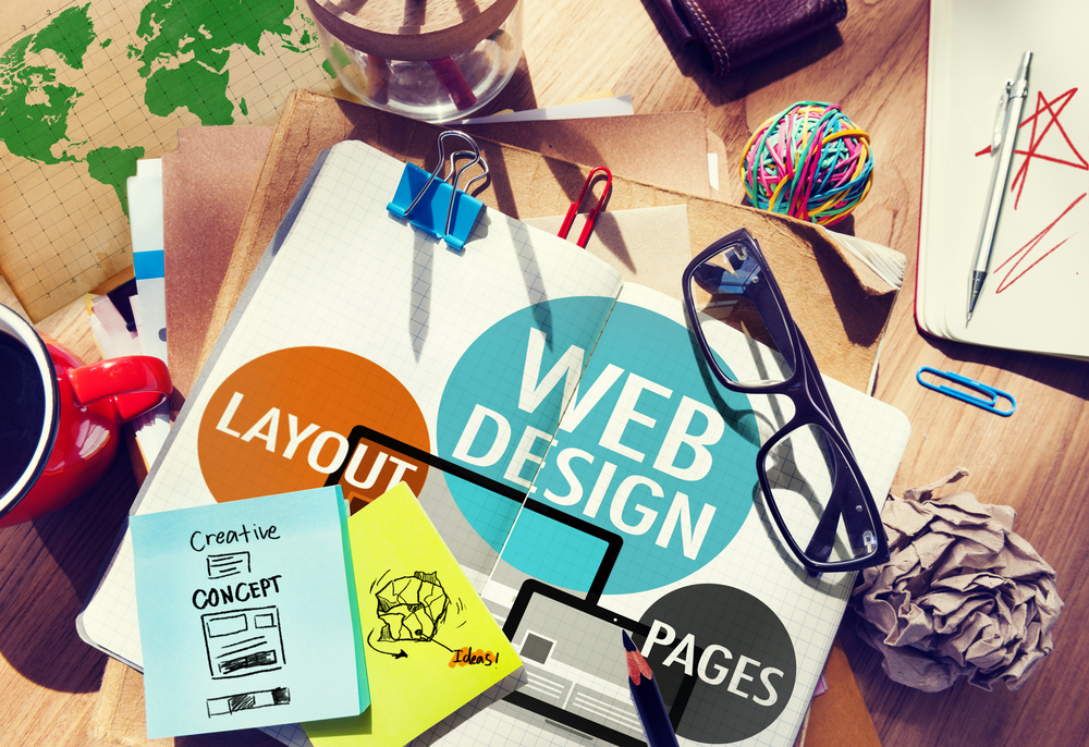
Don’t Make Me Think Part 1: Key Guidelines for Exceptional Website Design
Your company’s website is the first port of call for your customers. While there may have been a time when web design was a mere afterthought for business leaders, today it should be front and centre of your customer engagement strategy.
So if you’re really trying to build brand awareness and generate leads, then you’ll need to focus your site on being simple and optimised for usability and a great user experience.
In this two-part series, we will take a look at the four fundamental design principles that you should consider the next time your company overhauls its website so you can keep the site fresh and your customers happy. In Part 2 of the series, we will explore the four key guidelines for creating exceptional website usability and customer experience.
Key guidelines for exceptional website design
Simplicity
It can be a bit of a cliche to state the importance of keeping things simple but for web design it couldn’t be more true.
You want your site to be approachable and engaging.
If it’s cluttered with too many distracting animations or has tiny text, no one's going to want to read the information on the site no matter how interesting it is.
The look and feel of the site are important but ultimately people are coming to the site to find specific information or complete a certain action. Adding any unnecessary design elements that don’t serve any real function just make it harder for visitors to achieve what they really came to your site for.
Here are some examples of how to best prioritise simplicity:
Colours - To put it briefly - don’t use too many. The Handbook of Computer-Human Interaction recommends using a maximum of five (plus or minus two) different colors in your website's design so don’t try and reinvent the rainbow with your site.
Typefaces - The fonts you choose should be geared towards legibility. Another good recommendation is to use a maximum of three different typefaces in a maximum of three different sizes.
Graphics - Only use them if they help the user complete a task or perform a specific function. A good principle to keep in mind is to try and strip away all non-essential elements and only then start to add back in some visual texture, just enough so that the site doesn’t appear too spartan.
Visual Hierarchy
Closely tied to the principle of simplicity, visual hierarchy refers to the arrangement of website elements so that visitors naturally gravitate towards the most important elements first. It ties into both good design principles as well as usability, leading visitors to complete their desired action in a way that is simple and seems natural. This is achieved by adjusting the major design elements such as text and icon positioning, colour, and size. By modifying these elements in a cohesive way, your site will be structured in a way that visitors are drawn to the most useful elements first.
Some examples of good visual hierarchy include putting call to action buttons in prominent positions and making them stand out against the background through contrasting colour choice and positioning. The majority of users will find that elements placed on the left hand side of the page are preferable as most people naturally scan websites from left to right.
Conventionality
Now conventionality might seem like a strange goal for web design because it seems to imply making a site that doesn’t stand out at all. But instead, conventionality refers to the fact that over the years, internet users have become familiar with some certain page conventions. This includes:
- Having the main navigation at the top (particularly top left hand side) of the page
- Having a clickable company logo towards the top left of a page that allows the user to return to the homepage
- Having links change colour when you hover over them
- Using a shopping cart icon for e-commerce sites
There’s no set of rules requiring you to conform with these conventions and it may be tempting to start with a clean slate with the goal of making a unique and interesting page. But that would probably be a mistake. It would be a bit like designing a car where you decided the key ignition should be on the left. It still works fine but people would be a bit confused and frustrated.
So in order to give your users the best possible experience, you should try and take advantage of the layouts and web experiences that your users are already familiar with. It gives you a simple starting template to work from and makes the experience of using your site more familiar to the site’s visitors.
Consistency
The final key element of good website design is consistency. In this context it means that as well as navigation of the site being consistent, the overall look and feel of the site should be consistent across all of its pages. It means that the backgrounds, colour schemes, typefaces, and even the tone of the writing used should be consistent in order to leave a positive impression on users.
Consistency doesn’t mean that every page on the site must have exactly the same layout or that all text appearing on the site needs to be written by the same person. Instead, look for consistency at a smaller scale so that the layout for specific types of pages is uniform. It means that the layout and tone of text for all information pages, help pages, or landing pages is consistent. This makes it easier for site visitors to understand what type of information they’re likely to find on a given page type.
Now that you’ve got a good idea of the fundamentals of good website design, take a look at Part 2 of this series: Guidelines for Exceptional Website Usability and Customer Experience. And for more information on how to better engage with your key customers, reach out to FinXL.